SIGNAL
Designing an identity to grow
TMN® was never meant to be a brand in the marketing sense. It was conceived as a system—a living structure capable of growing, mutating, simplifying, and still remaining itself. That intention shaped every design decision from the beginning.
By Pablo Herrera, TMN® Founder and CEO
I didn’t design the TMN® symbol to be liked. I designed it to hold meaning, tension, and time. This is not a logo that tries to explain itself. It’s a symbol designed to work. Here is the story behind its form.
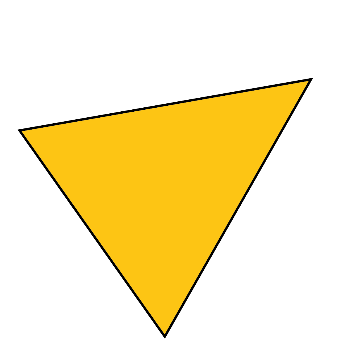
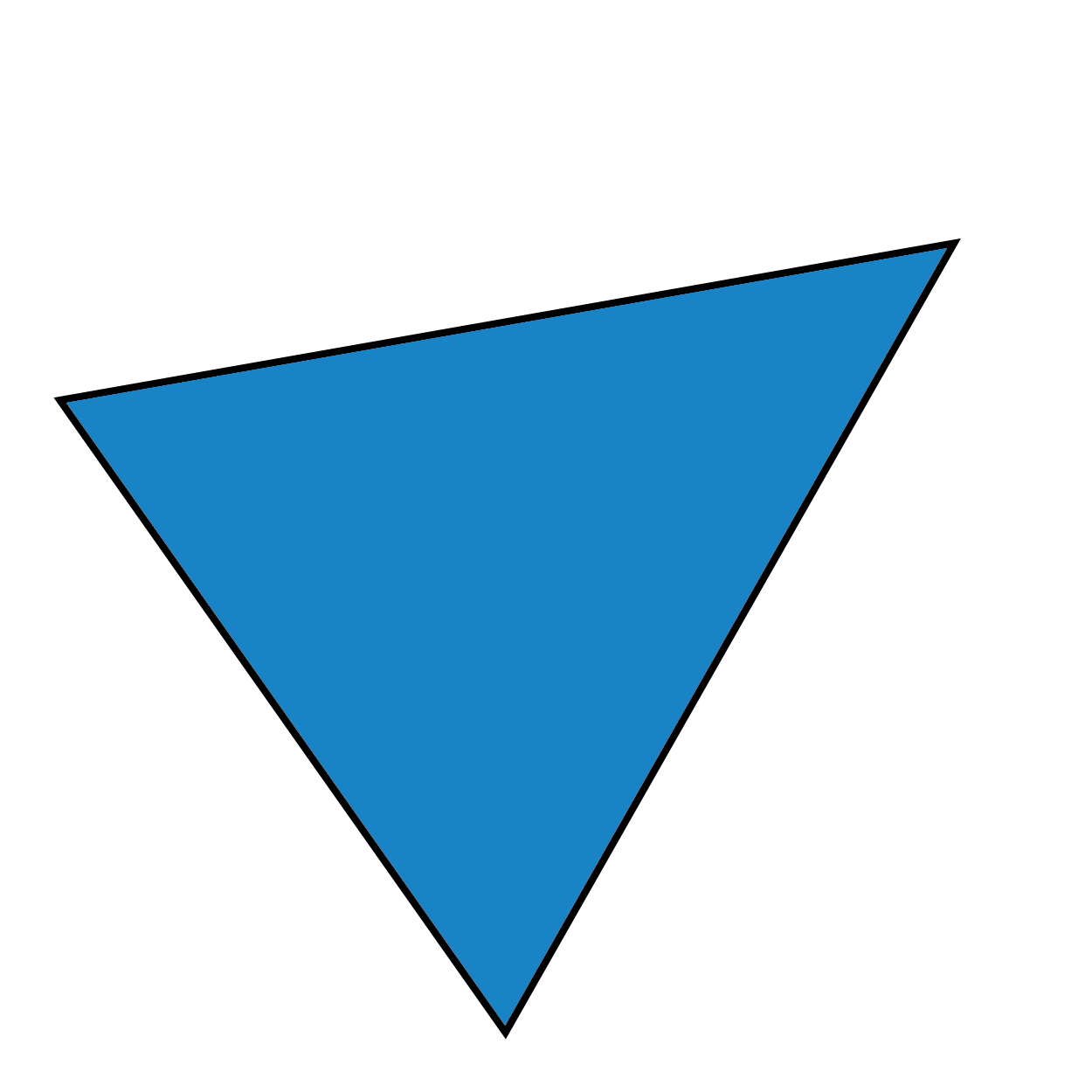
The Triangle: Kindness, Trust, Respect
At the core of TMN® there are three non-negotiable values:
Kindness
Trust
Respect
These values form the triangle.
Not as ornament.
Not as metaphor.
As structure.
The triangle is the most stable geometric form. Remove one side and it collapses. TMN® works the same way. If one of these values disappears, the system stops functioning.
That’s why the triangle is not treated as a decorative element behind the letters. It’s a load-bearing idea. It holds the system together.
Why the Triangle Is Not “Perfectly” Centered


The TMN® triangle is not equilateral, and it is not mathematically centered inside a container. This is intentional.
TMN® was designed for people, not for grids.
Balance here is optical, not academic. What matters is not whether elements align perfectly on paper, but whether the system feels stable, alive, and directional.
The triangle doesn’t sit politely behind the wordmark “TMN”. It engages with it.
The M as the Point of Balance
The visual and energetic center of the TMN® symbol is not the full “TMN” block.
It is the M.
The M represents the core of what TMN® is built on:
Media. Mentorship. Mind.
Media, because creation is not simulated but real.
Mentorship, because learning happens through guidance, not hierarchy.
Mind, because critical thinking and imagination are the true engines of growth.
Visually, the M carries the yellow, the strongest and most visible color in the system. It acts as the anchor of the symbol, concentrating energy at the center while allowing the rest of the elements to expand.
From this point of balance, the system holds together:
the upward pull of the triangle,
the outward movement of the letters,
and the forward momentum of the mark.
The M doesn’t dominate the system. It activates it.
Symmetry as Expansion, Not Containment
What some people perceive as asymmetry is often just a matter of where they choose to look from.
The TMN® symbol is not designed to be read from the outside in, but from the inside out. Symmetry here is not defined by a bounding box or an enclosing shape, but by the internal forces that generate balance.
Rather than imploding elements into a centered container, the system expands outward from its energetic core. The M becomes the axis. The triangle becomes structure.
This distinction matters.
External symmetry creates static objects.
Internal symmetry creates living systems.
TMN® was designed as the latter.
Color as Energy, Not Decoration
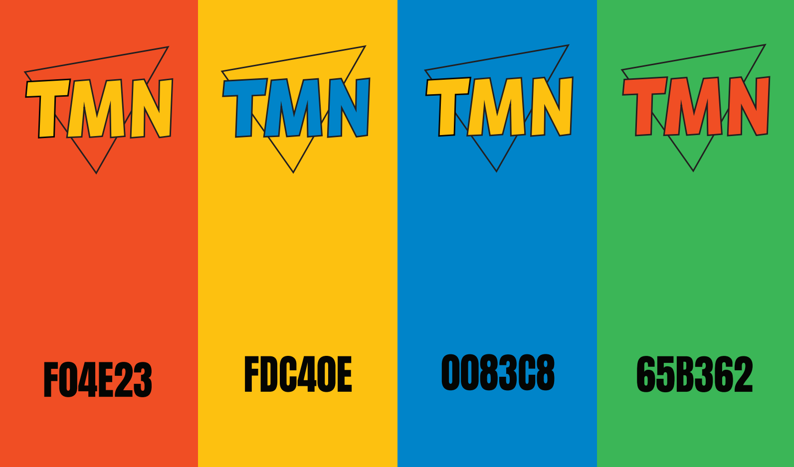
The TMN® color system was shaped early and refined intuitively, then reinforced through branding sessions with young creators.
Each color plays a precise role:
Yellow (M): energy, clarity, learning, presence
Orange (T): creativity, warmth, activation
Blue (N): trust, depth, continuity
Green (Triangle): growth, balance, life
Yellow sits at the center because TMN® is powered by learning—not institutional learning, but living, active learning.
The black outline reinforces contrast and legibility, while introducing a bold, graphic presence. TMN® doesn’t whisper. It stands its ground.
Typography: Strong, Human, Direct
The TMN® lettering uses Orgovan Brush (Adobe type).
Not custom.
Not precious.
Not over-designed.
TMN® is not about typographic ego. It’s about voice.
This typeface brings:
strength without rigidity
personality without irony
presence without trend dependence
It works in motion. It works small. It works loud.
From Mood Board to Symbol
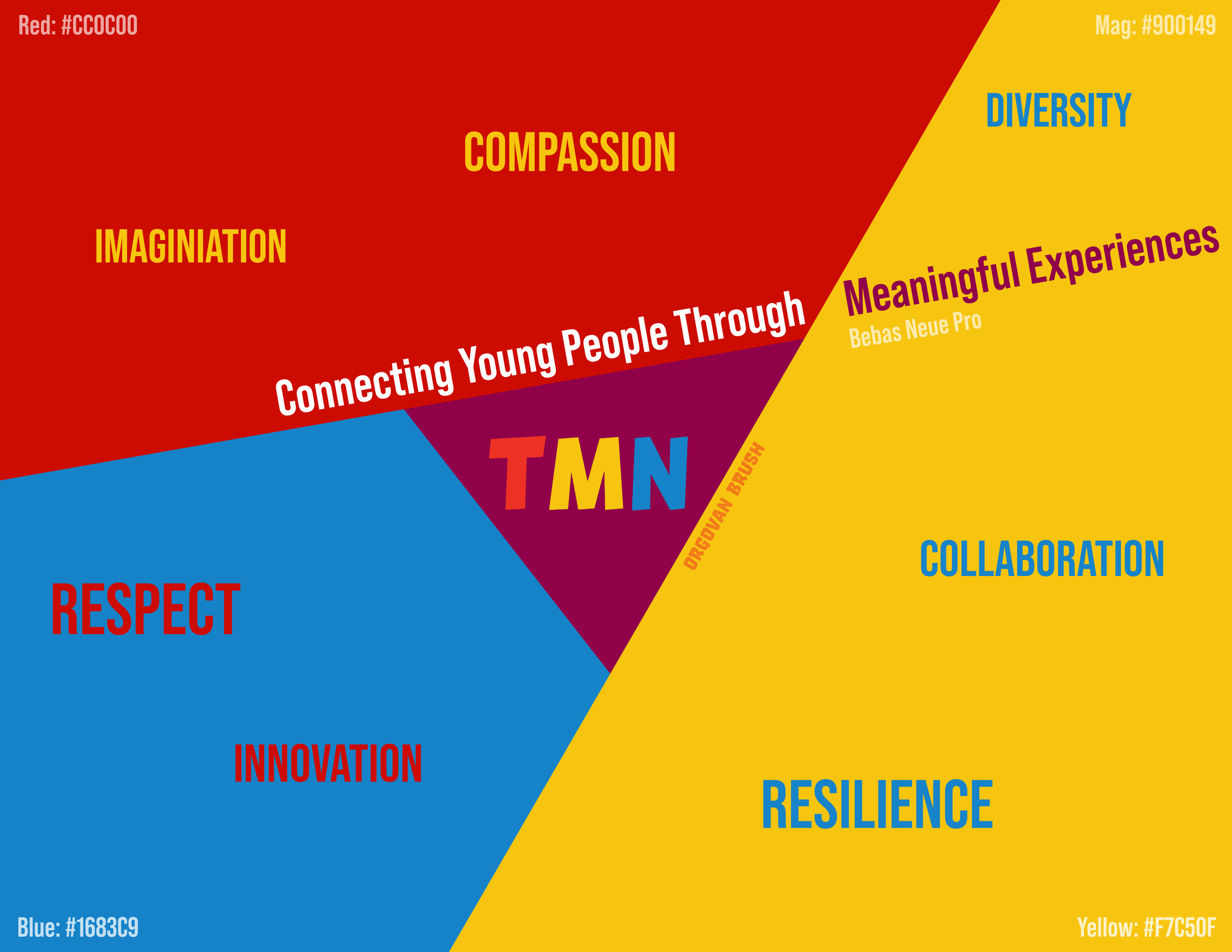
TMN® First Mood Board. September 2023.
The TMN® symbol emerged from a mood board built after multiple branding sessions with young creators. Those sessions didn’t aim to “define a look.” They surfaced shared values, instincts, and ways of seeing the world.
Words that kept coming back:
imagination
compassion
diversity
collaboration
resilience
respect
The logo is the compressed form of that collective thinking. A reduction. A distillation. Bauhaus logic applied to lived experience.
The Branding Session: Pressure, Debate, and Clarity
The TMN® identity didn’t emerge in isolation. It was shaped through dialogue, questioning, and sometimes friction.
During one of the early branding sessions, led by a South African branding strategist Lisa Jade Hutchings, working with the TMN® team, core assumptions were openly challenged—including the use of the word “teens,” the tone of the brand, and the responsibility that comes with representing young people in public space.
This session wasn’t about aesthetics. It was about values under pressure.
The questions raised forced clarity:
What do we stand for?
Who are we really building this for?
And what are we willing not to compromise?
The outcome of those conversations didn’t dilute TMN®. They strengthened it. The triangle, the color system, and the final symbol emerged not as a compromise, but as a refined response to those challenges.
That process is documented in the session below, which captures a formative moment in the creation of TMN®’s identity:
A System, Not a Frozen Mark
TMN® was designed to evolve.
That’s why:
the triangle can exist alone (favicons, watermarks, night mode)
the TMN® wordmark stands on its own (institutional use)
both coexist without competing
Over time, the triangle may become the primary symbol. That’s not a loss. That’s success.
Strong identities don’t explain themselves forever. They become recognized.
The TMN® wordmark stands on its own for institutional use without competing but complimenting each other.
A Final Note on Seeing Differently
If the TMN® symbol feels asymmetrical, look again.
Not from the edges, but from the M.
Not from the container, but from the structure.
TMN® signals something deeper: divergent thinking, non-linear learning, and the idea that not everyone sees from the same place—and that this difference is not a flaw, but a strength.
If you can shift your perspective and recognize the balance, you’ve already understood something essential: perception is not universal. And that’s a good thing.
TMN® doesn’t follow social conventions. It questions them. It challenges what feels “normal” or “correct,” because humanity doesn’t innovate by repeating what already exists.
Some symbols explain themselves.
Others invite you to see differently.
TMN® is the latter.
— Pablo Herrera
Founder, Teens Media Network®
Ready to start shooting festivals like a pro?
TMN® Members can start the course today 🚀
More tools.
More opportunities.
More real learning.
Welcome to TMN® Learning.
Share this post: